The What:
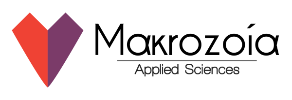
Marakzoya is a biotech research and development think tank that is focused on extending the human lifespan and increasing long-term quality of life. Markozoya (μακροζωία) is greek for “long life” as the group is located in Greece. However, to appeal to an international audience, they wanted a english-centric rebrand.
This was a conceptual project, in which I wanted to focus on using subtle details to enhance a design.
The How:

I first looked for a good and modern font with minimal serifs that had multi-lingual support. I then took the phonetic pronunciation “Markozoya” and added greek characters that appeared similar to english ones, allowing for a direct link between the english-readable name to the greek origin.
For the iconography I added a two-tone heart, with harsh edges at the top to link to the logotype, while featuring a subtle curve at the bottom to relate to the softness and frailty of the human condition.

